
Credit Cards
Recommendations
Project
The credit card product offers an overview of top credit cards focusing on the net reward as the key decision for users to pick and apply for the credit card information. The current design is presented in a table view that users can see the net reward from each credit card. The outcomes are a low conversion rate.
The business goal is to increase the conversion rate. I led the design strategy from discovery to launch.

Challenges
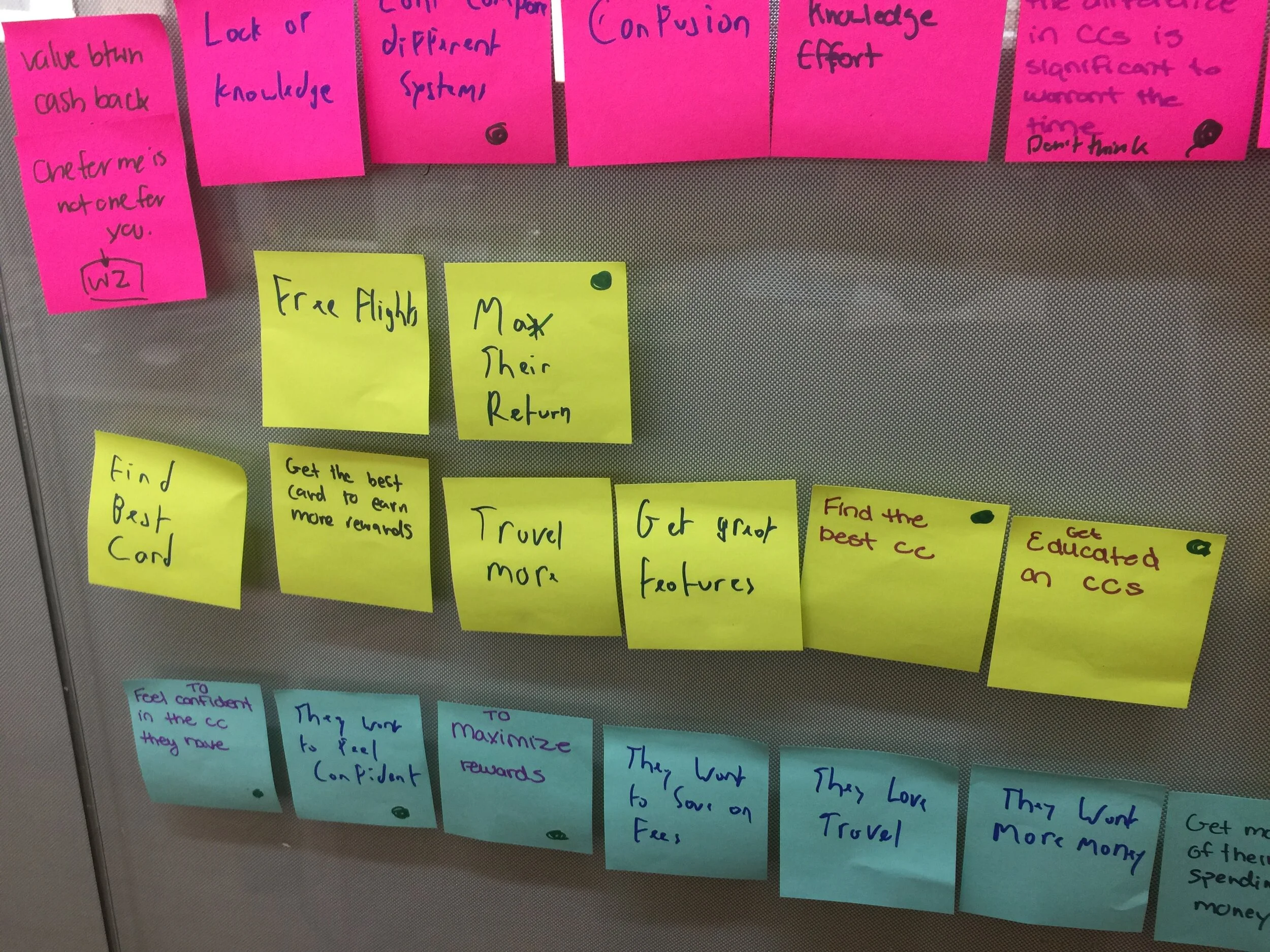
No universal point calculation system. No easy way to compare from card to card
Users don’t get the full picture of the total value their earn so make a prompt decision to annual fee exemption
Users are overwhelmed with the information provided so abandon the signup process

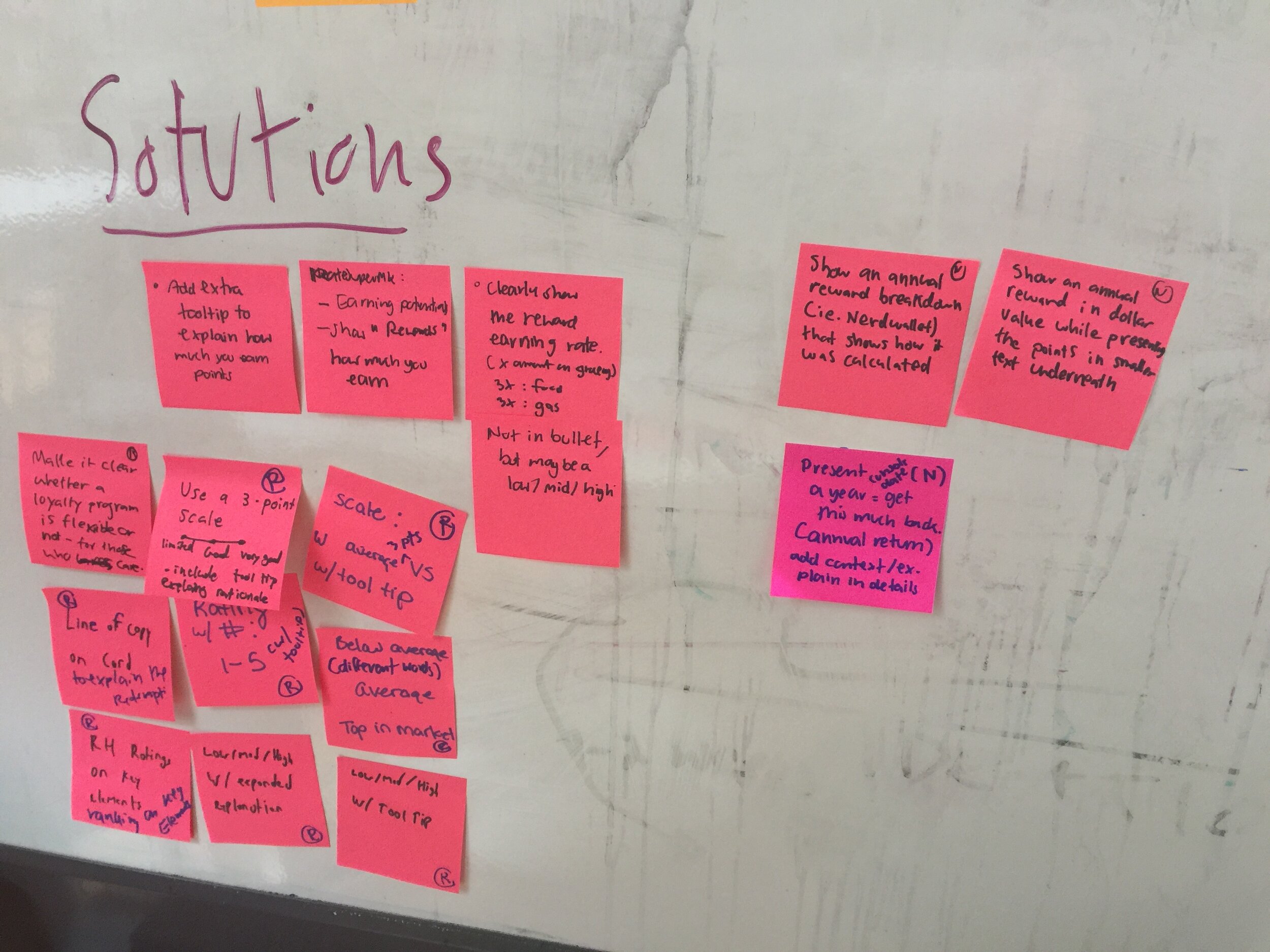
Solutions
Provide cards recommendation (5 cards by default) based on preference and spending amount
Focus on “total dollar earn” for a quick comparison
Provide a simple dollar-earn calculation
Add “redemption flexibility” and a short explanation as a key information
What we learned
Overall, users like the recommendation page as it covers the essential information about the card features, how the cards are ordered, and just enough choices
Users would like to understand more how we rate the redemption flexibility or see more explanations in detail.
Features help users to narrow down card choices but not necessarily the only decision choosing a card
Users want to know which card has the best return value for the lowest cost. However, not everyone makes decisions based on the return value. It depends on the users’ goals. Some users made a decision based on the big number alone, a combination of net rewards & total value, or go with the middle ground (history and current card have a high impact on the decision)
Calculation
No users read the copy above the Big Number. May need a separate study for the copy. They understand that number is the total value they will get per year.
Users prefer a simple, logical breakdown. Both points and value per point are important.
Users value the year-on-year and long-term value (even with the cost-conscious user type), however, they also want to know how much they get for the first-year bonus.

Design Process
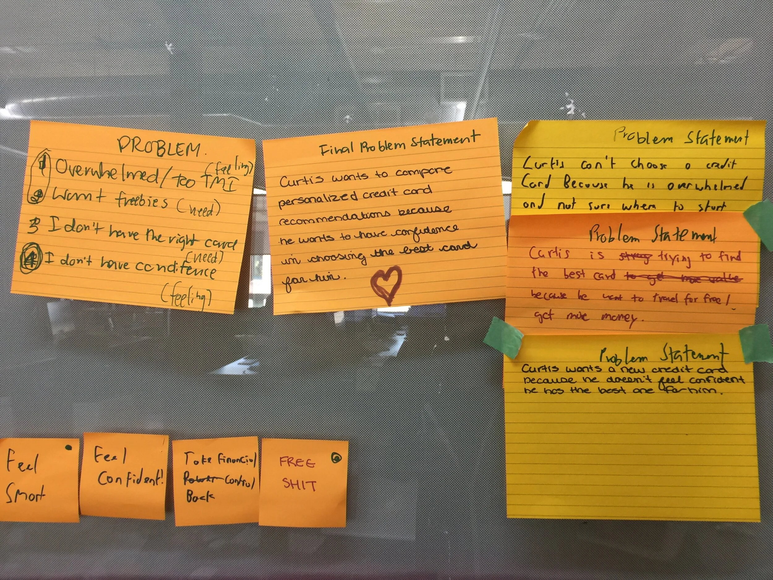
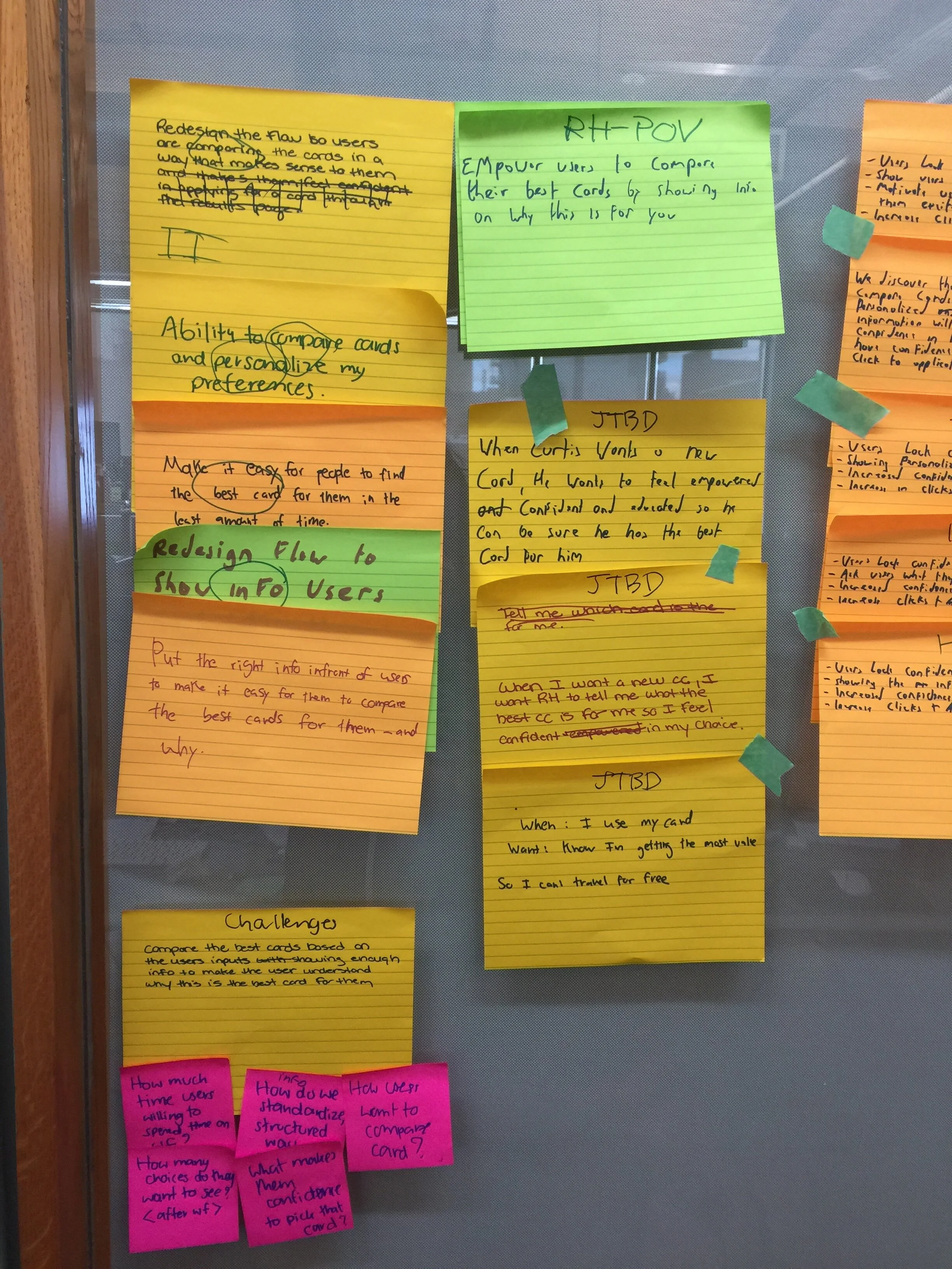
Problem statement
Curtis wants to compare personalized credit card recommendations because he wants to have confidence in choosing the best card for him.
And other problems
Feel overwhelmed because too much information
I need freebies
I don’t have the right card
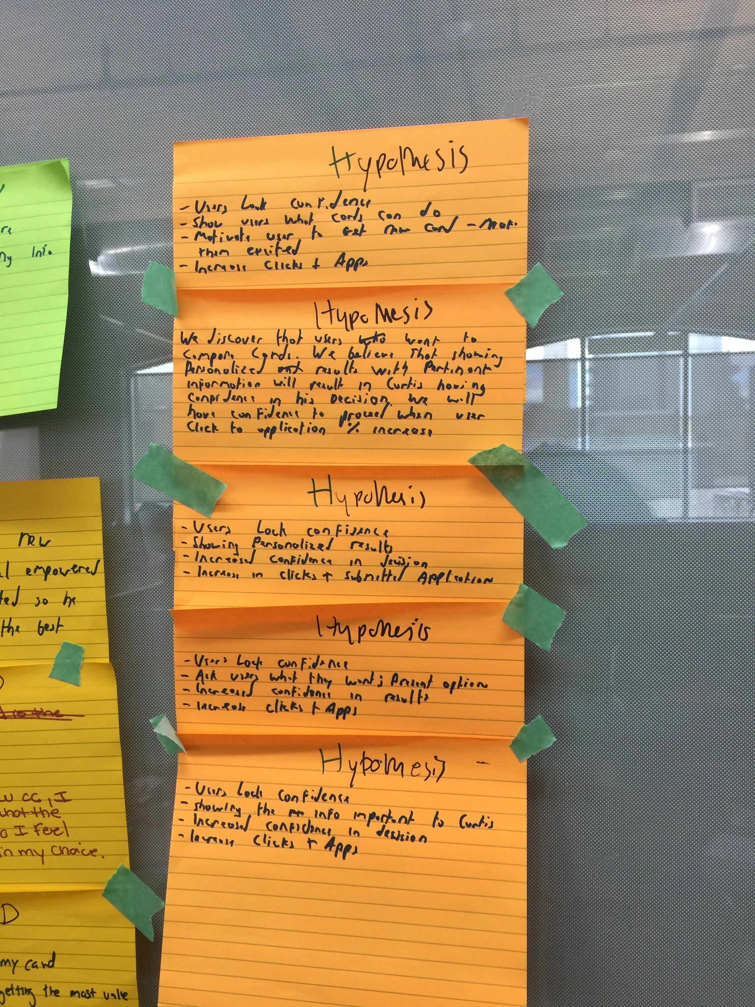
Hypothesis
We discover that users can’t pick the right card. We believe that showing personalized and results with pertinent information will result in Curtis having confidence in his decision. We will have the confidence to proceed when users click to application 10% increase.
How might we
HMW make it clear whether a loyalty program is flexible or not for those who care
HMW use different words to explain: Below average, Average, Top in the market
HMW match score to what user is done with the explanation.
HMW have a full list of features in details, but in table display just the features it does have from their top 5 (omit ones it's missing)
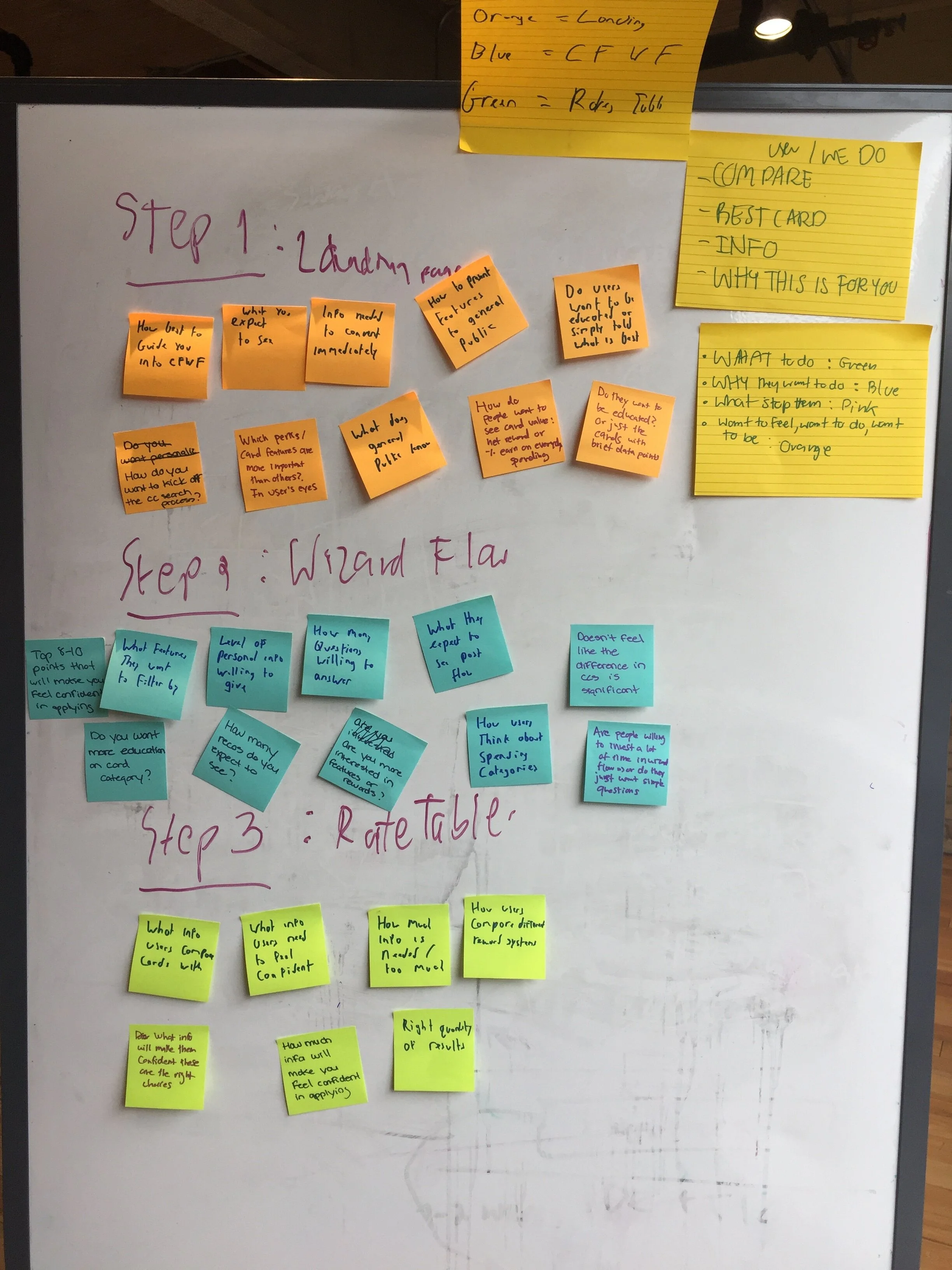
Usability testing
Miro board includes motivations, user quotes, insights, sketching, decision criteria, affinity diagram, credit card personas
View board

User interview results

User’s hierarchy of decision to get a credit card

Users’ quotes
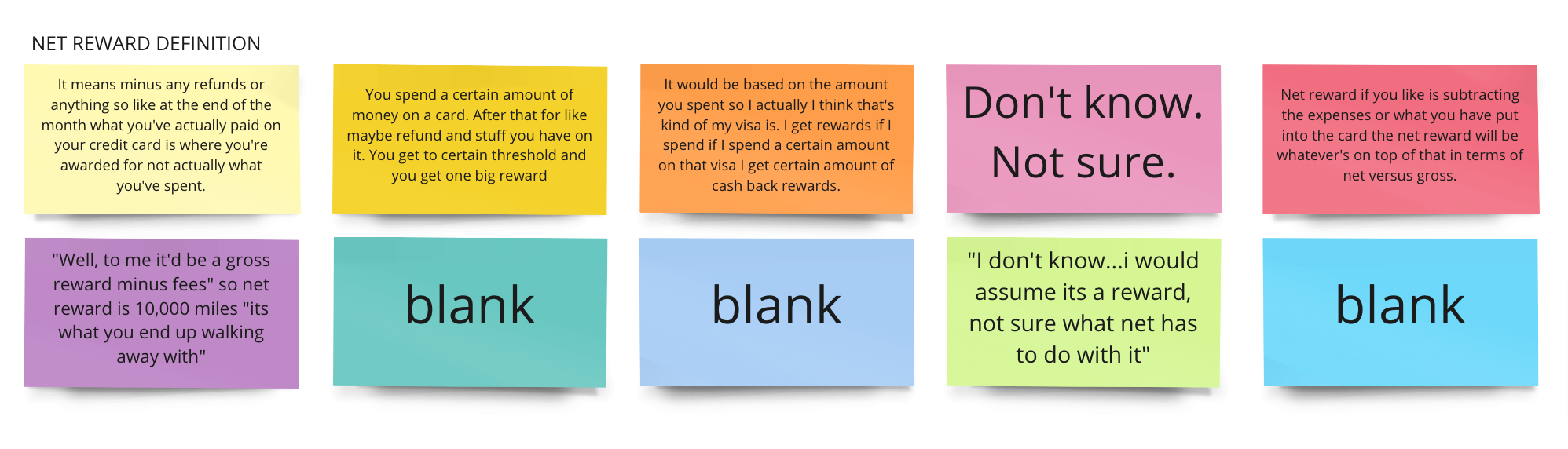
User’s understanding of “Net reward”


